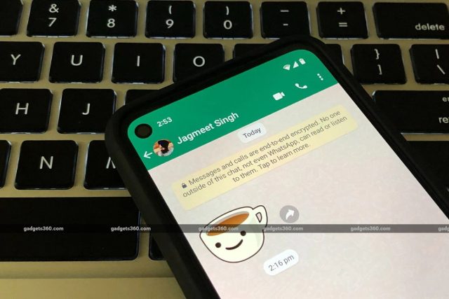
WhatsApp has finally begun testing a revamped interface on Android, months after the company was spotted working on a redesigned version of the popular chat application. The new interface ditches WhatsApp’s iconic green-coloured top bar in favour of a white top bar, in the main chat list and inside individual chats. The new design is also aligned with Google’s Material Design 3 guidelines and improves the appearance of dark theme. WhatsApp has also added new ‘outline’ icons for various buttons in the app, as part of the latest beta update.
A Gadgets 360 staff member’s app received the redesigned interface on the latest beta version — WhatsApp beta for Android 2.23.21.12. After installing the latest beta, testers should begin to see a redesigned interface that includes a white bar at the top, with the WhatsApp text in green (the stable version of the app currently displays the app’s name in white on a dark green background). When the dark theme is enabled, the top bar now turns black and the text is displayed in white.![]()
WhatsApp has also tweaked the colour of the green accent used in the app, on both the light and dark themes in the app. As a result, the colour of the floating action button and other parts of the interface with the green accent — such as the floating action button (FAB) — appear a little brighter, especially when the dark mode is turned on.
In addition to the new colour tweaks on the Android app, WhatsApp has also replaced the solid icons for voice and video calls inside individual chats, as well as the camera icon on the main chat list, with outlines of the existing icons. These icons were previously spotted last month by a feature tracker on version 2.23.20.10 of WhatsApp beta for Android.
WhatsApp is also working on updating the colour palette for its iOS app, along with the new outline icons — the new design elements were recently spotted on WhatsApp beta for iOS 23.19.1.72. Unlike its Android counterpart, however, WhatsApp for iOS does not contain a green-coloured top bar on the stable version of the app.
While the new interface does not appear to have made its way to iOS beta testers, both mobile platforms are also expected to gain support for new chat filters such as All, Unread, Contacts, and Groups, that could make managing several chats a lot easier. These filters, along with the redesigned interface, are expected to roll out to users on the stable channel in the coming months.


