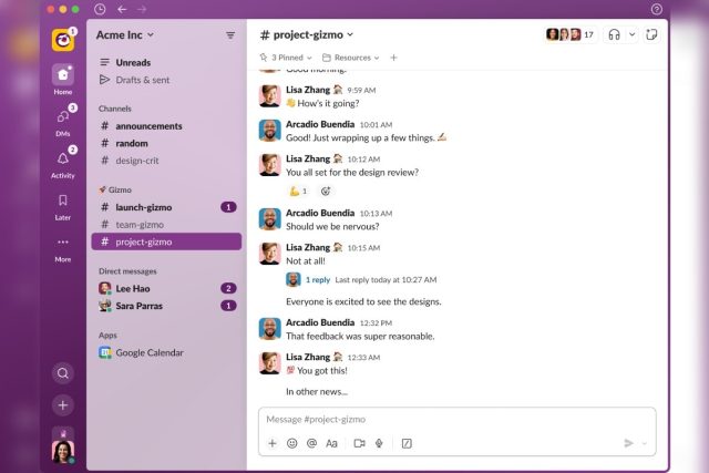
Slack is redesigning its app as part of the company’s efforts to make the app easier to use. The business messaging app has improved the search function on the web interface and its desktop and mobile apps, while offering better navigation for channels and direct messages (DMs) across multiple workspaces on Slack. Meanwhile, the Salesforce-owned service is also making it easier for users to start new chats, channels, calls, or canvases from a single button on the redesigned version of the app.
The company unveiled the redesigned version of the app via its blog on Wednesday, showing a new Home interface that shows all DMs, channels, and apps. The company says it should look familiar to the existing version of Slack, but the images shared by the firm suggest the new design somewhat resembles its closest competitor — Microsoft Teams. The new Home section will also show channels across workspaces in an Enterprise Grid organisation, according to the company.
![]()
The redesigned Slack interface
Photo Credit: Slack
Users will also be able to see mentions, threads, reactions, and app notifications in a new Activity tab. Slack currently displays threads, app notifications, and reactions to messages in separate tabs on the left side, which will all show up under the Activity tab when the redesigned interface is rolled out. Meanwhile, a new Create button located at the bottom left corner will allow users to start a new message, canvas, huddle, or channel via a small floating menu.
Slack recently introduced a new Later section for messages that can be used to save and access them at a later date. The redesigned version of the app will include a dedicated tab for messages that have been saved under this category.
Finally, Slack has also announced a new and improved search interface for the app. A new split view will allow users to see search results on the left side — clicking a result will show the messages with context on the right side, which means that users won’t have to keep opening results in a new view and navigating back until they find the message they are looking for on the service.
The redesigned Slack app will roll out to current users and organisations over the coming months, a decision that was probably taken to prevent disruption of processes of existing teams due to the changes to the interface. Meanwhile, new users who sign up for the service will have access to the new version of Slack, according to the company.


![[VIDEO] Agya Koo celebrates like Cristiano Ronaldo after scoring penalty](https://ghananewss.com/storage/2023/02/BeFunky-collage-2023-02-17T164545.706-scaled-100x75.jpg)


